Homepage
Navigation
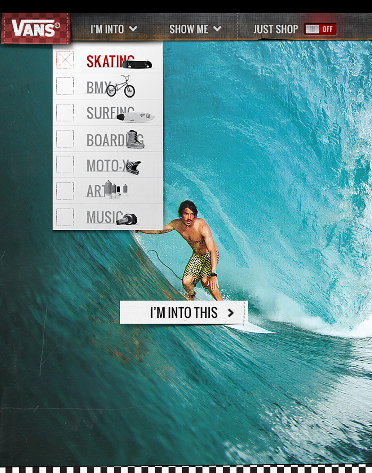
Vans is such a rich, relevant brand with so much great content, that we knew we had to create a simple way to get to all the information. So the first thing we did was strip down the navigation and focus it around lifestyles instead of product lines.
Homepage
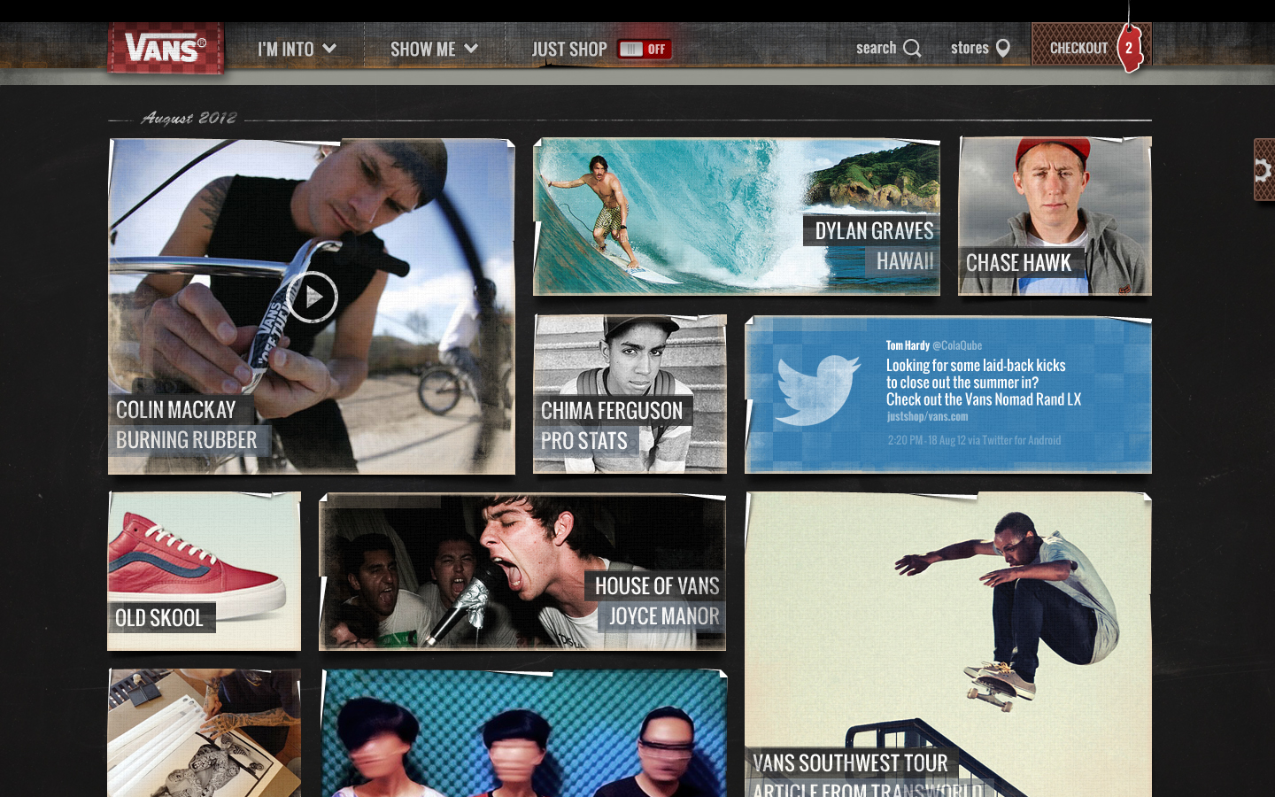
This allowed us to clean up and organize the homepage. So when people got there – they would immediately see the expansiveness and diversity of the Vans world.
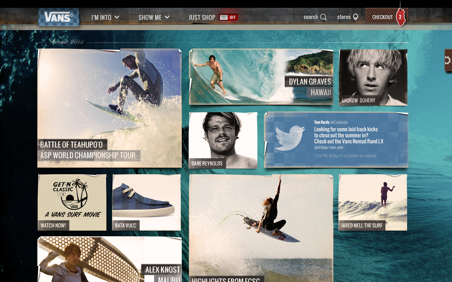
Vans.com was all about filtering. If someone selected SKATEBOARDING from the nav, all the products, photos, videos, articles, social feeds, music etc. would rearrange to filter out anything that wasn’t relevant to that sport. This made it easy to surface all kinds of buried content and it was a system that could be easily applied to every other part of the site.
Once the content was filtered, the design system we developed was flexible enough to still feel like you were on a unique page. So the SKATEBOARDING page felt and looked different then the SURFING page.
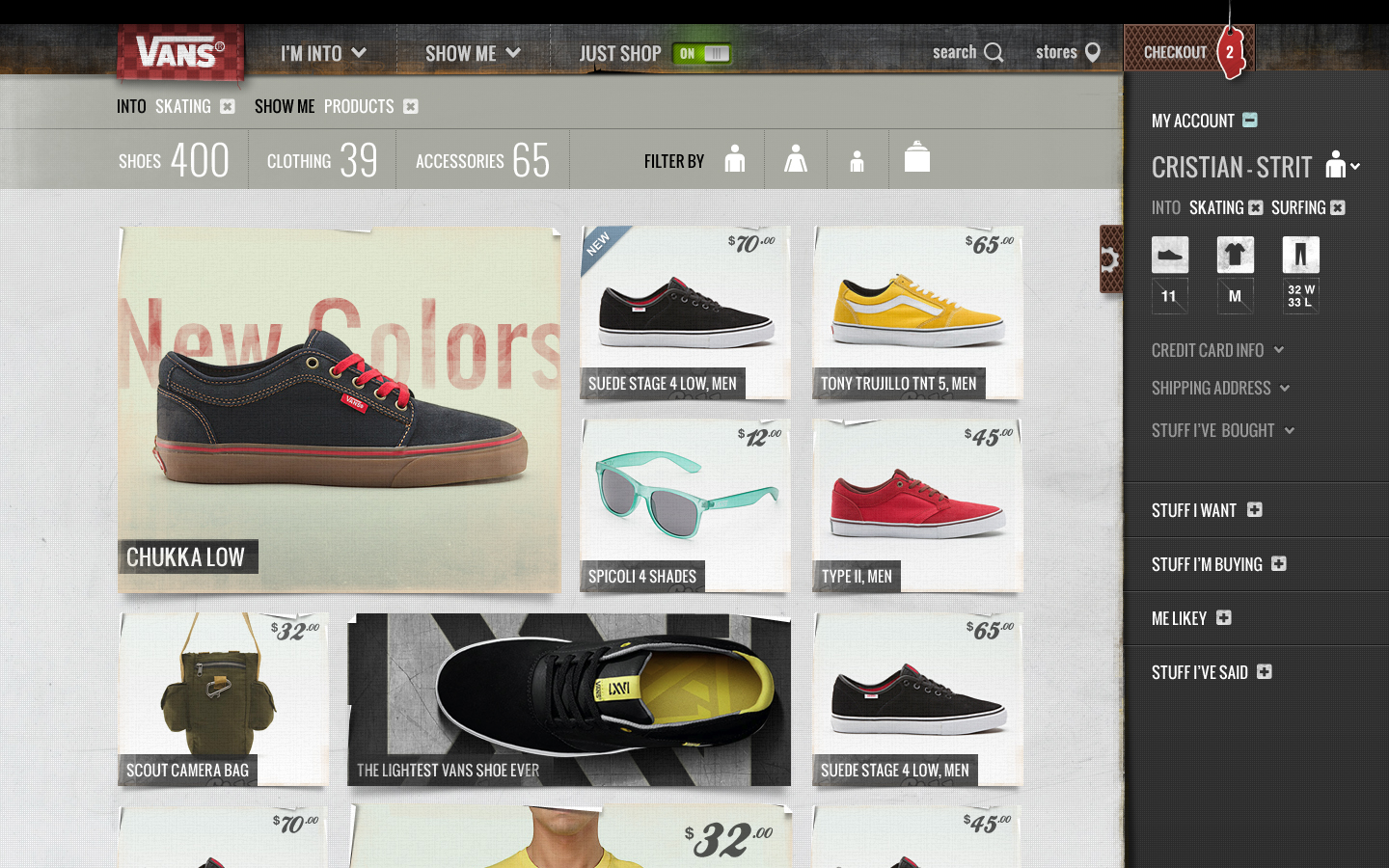
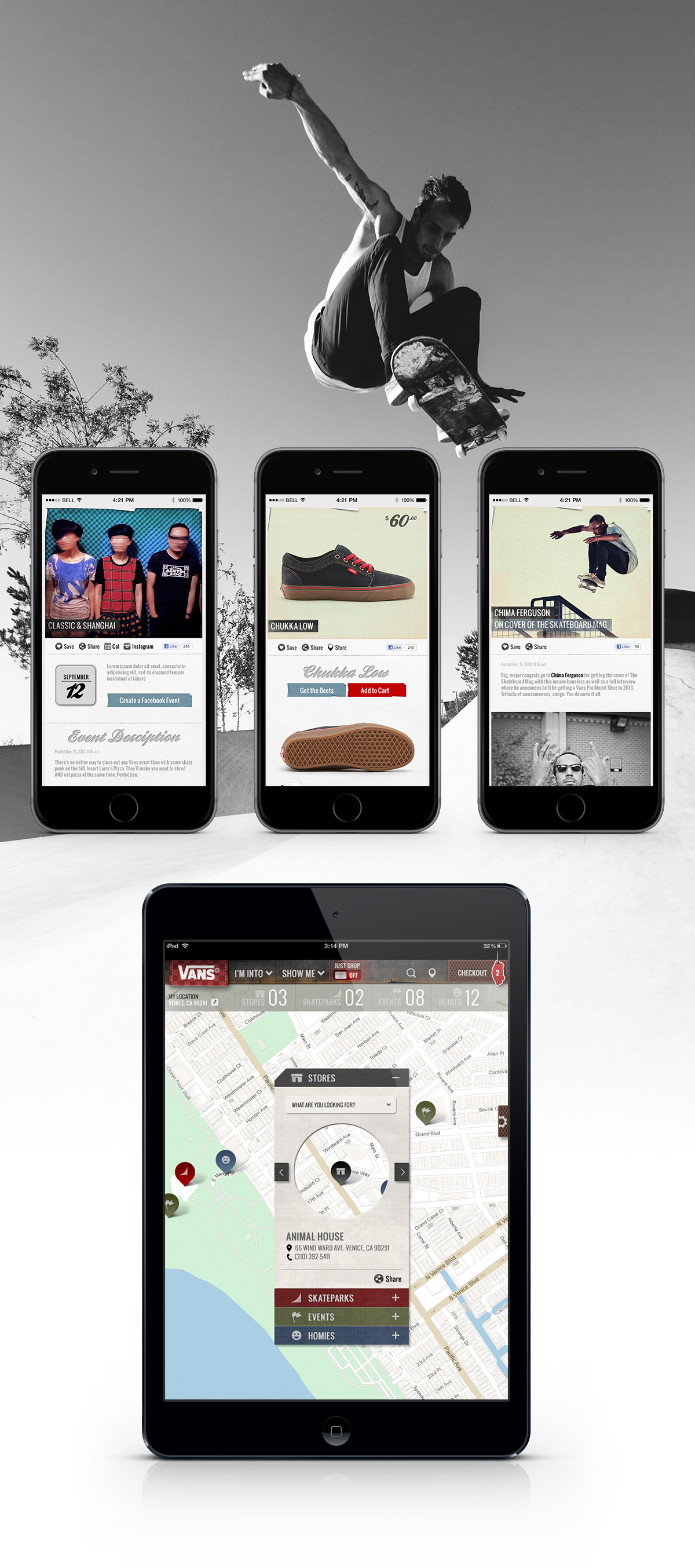
Of course, Vans needs to move product. So we added a JUST SHOP toggle to the main nav. Once turned on, the site would filter out everything that wasn’t product specific.
Era Pro Details
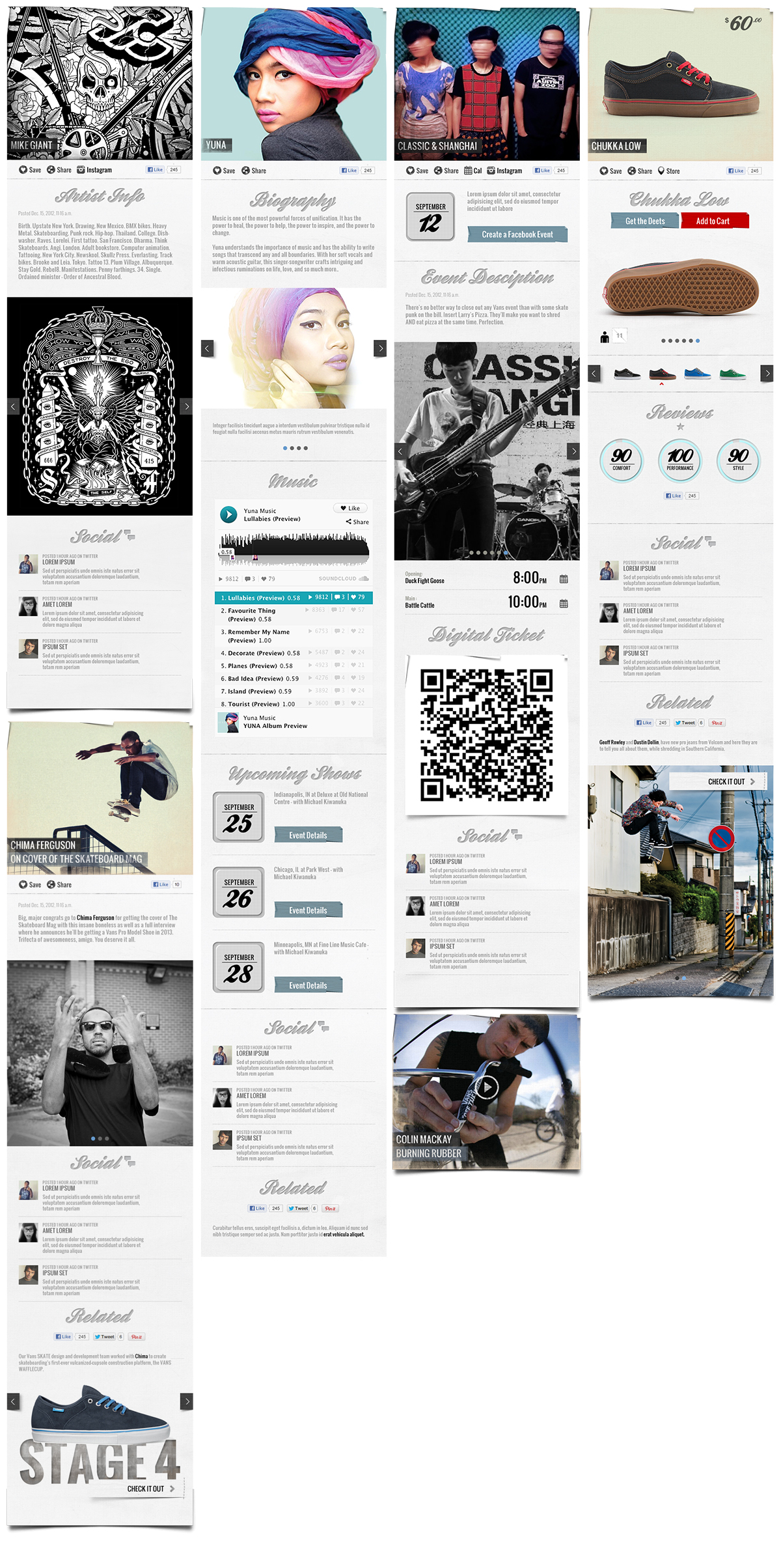
Outside of the JUST SHOP feature, we always kept products in the context of the lifestyle they were designed for. Meaning you’d never just see a straight up shoe without it being in the context of the Vans pros who use them, stories about how and why it was developed, product reviews, related items and ideas for putting a whole head-to-toe hookup together.
Responsive
Knowing the Vans customer is always on the move, the site was responsively designed to work on laptop, tablet and mobile. No matter the screen size, the site would configure and reorder itself to show the same content – in a way that was intuitive to the device being used.
Components
There were tons of other bells and whistles we came up with. But I’m not gonna show those so we can repurpose them again for another pitch.


